
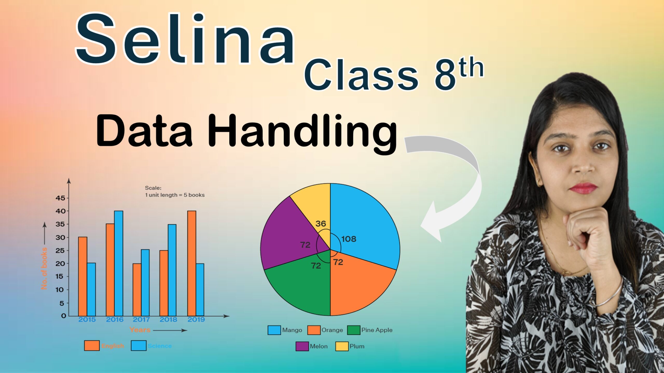
Exercise: 24
Q1: Multiple Choice Type
i. Lower class limit of \(15-18\) is:
Step 1: In a class interval, the first value is called the lower class limit.
Step 2: Given class interval \(15-18\).
Step 3: Here,
Lower class limit \(= 15\)
Upper class limit \(= 18\)
Answer: a. \(15\)
ii. Upper class limit of \(5-12.5\) is:
Step 1: In a class interval, the last value is called the upper class limit.
Step 2: Given class interval \(5-12.5\).
Step 3: Therefore,
Lower class limit \(= 5\)
Upper class limit \(= 12.5\)
Answer: b. \(12.5\)
iii. If the upper and the lower limit of a class interval are \(16\) and \(10\), the class-mark is:
Step 1: Formula of class-mark:
\(\text{Class-mark} = \frac{\text{Upper limit} + \text{Lower limit}}{2}\)
Step 2: Substitute the given values.
Upper limit \(= 16\)
Lower limit \(= 10\)
Step 3:
\(\text{Class-mark} = \frac{16 + 10}{2}\)
\(\text{Class-mark} = \frac{26}{2}\)
\(\text{Class-mark} = 13\)
Answer: c. \(13\)
iv. If the lower and the upper limits of a class interval are \(7.5\) and \(12.5\), the class-mark is:
Step 1: Formula of class-mark:
\(\text{Class-mark} = \frac{\text{Upper limit} + \text{Lower limit}}{2}\)
Step 2: Substitute the values.
Upper limit \(= 12.5\)
Lower limit \(= 7.5\)
Step 3:
\(\text{Class-mark} = \frac{12.5 + 7.5}{2}\)
\(\text{Class-mark} = \frac{20}{2}\)
\(\text{Class-mark} = 10\)
Answer: a. \(10\)
v. In a pie-chart, an angle of \(30^\circ\) represents \(80\) articles. The number of articles represented by \(105^\circ\) are:
Step 1: Write the given information.
\(30^\circ\) represents \(80\) articles.
Step 2: Find articles represented by \(1^\circ\).
Articles for \(1^\circ = \frac{80}{30}\)
Step 3: Find articles represented by \(105^\circ\).
Articles \(= \frac{80}{30} \times 105\)
Step 4:
Articles \(= \frac{80 \times 105}{30}\)
Articles \(= 80 \times 3.5\)
Articles \(= 280\)
Answer: a. \(280\)
vi. In a pie-chart, \(76\) articles are represented by \(19^\circ\); how many articles will be represented by \(76^\circ\)?
Step 1: Write the given information.
\(19^\circ\) represents \(76\) articles.
Step 2: Find articles represented by \(1^\circ\).
Articles for \(1^\circ = \frac{76}{19}\)
\(= 4\)
Step 3: Find articles represented by \(76^\circ\).
Articles \(= 4 \times 76\)
Articles \(= 304\)
Answer: c. \(304\)
Q2: Hundred students from a certain locality use different modes of travelling to school. Draw a bar graph.
| Bus | Car | Rickshaw | Bicycle | Walk |
|---|---|---|---|---|
| 32 | 16 | 24 | 20 | 8 |
Step 1: Define Axes
Vertical Axis (Y): Number of Students
Horizontal Axis (X): Mode of Travel
Step 2: Set Scale
Scale: 1 unit length = 4 students.
Answer:
The vertical bar graph is successfully plotted. The “Bus” mode has the highest frequency (32), while “Walk” has the lowest (8).
Q3: Mr. Mirza’s monthly income is ₹7,200. He spends ₹1,800 on rent, ₹2,700 on food, ₹900 on education of his children, ₹1,200 on other things and saves the rest. Draw a pie-chart to represent it.
Total Monthly Income = ₹7,200
Savings = 7,200 – (1,800 + 2,700 + 900 + 1,200) = ₹600
Step 1: Finding Central Angles
Central Angle = (Component / 7200) × 360°
1. Rent: (1800/7200) × 360° = 90°
2. Food: (2700/7200) × 360° = 135°
3. Education: (900/7200) × 360° = 45°
4. Others: (1200/7200) × 360° = 60°
5. Savings: (600/7200) × 360° = 30°
Answer:
The pie-chart above represents the monthly budget of Mr. Mirza. The angles are calculated by dividing each expense by the total income (7,200) and multiplying by 360°.
Q4: The percentage of marks obtained in different subjects by Ashok Sharma are given below. Draw a bar graph to represent it.
| English | Hindi | Maths | Science | Social Studies |
|---|---|---|---|---|
| 85 | 60 | 35 | 50 | 70 |
Step 1: Identify the Axes
Vertical Axis (Y-axis): Percentage of Marks
Horizontal Axis (X-axis): Subjects
Step 2: Choosing a Scale
Since the maximum value is 85, we can choose a scale of 1 unit = 10%.
The Y-axis will be marked as: 0, 10, 20, 30, 40, 50, 60, 70, 80, 90, 100.
Answer:
The bar graph shows that Ashok Sharma performed best in English (85%) and requires improvement in Mathematics (35%). All subjects are clearly plotted on the Horizontal axis against their respective percentages on the Vertical axis.
Q5: The following table shows the market position of different brands of tea leaves. Draw a pie-chart to represent the above information.
| Brands | A | B | C | D | others |
|---|---|---|---|---|---|
| % Buyers | 35 | 20 | 20 | 15 | 10 |
Step 1: Calculate Central Angles
Formula: Central Angle = (Percentage / 100) × 360°
1. Brand A: (35 / 100) × 360° = 126°
2. Brand B: (20 / 100) × 360° = 72°
3. Brand C: (20 / 100) × 360° = 72°
4. Brand D: (15 / 100) × 360° = 54°
5. Others : (10 / 100) × 360° = 36°
Step 2: Visual Representation
Answer:
The pie-chart represents the market share of different brands. Brand A occupies the largest sector with a central angle of 126°, while ‘Others’ occupies the smallest sector with 36°. The total of all central angles is 360°, which confirms the complete circle representation.
Q6: Students of a small school use different modes of travel to school as shown below. Draw a suitable bar graph.
| Modes | Bus | Car | Bicycle | Auto | On foot |
|---|---|---|---|---|---|
| No. of students | 142 | 98 | 50 | 34 | 16 |
Step 1: Define the Axes
On the Vertical axis (Y-axis), we take the “Number of Students”.
On the Horizontal axis (X-axis), we take the “Mode of Travel”.
Step 2: Choose a Suitable Scale
Since the maximum number of students is 142, we can choose a scale:
1 unit length = 20 students.
The Y-axis will be marked as: 0, 20, 40, 60, 80, 100, 120, 140, 160.
Step 4: Comparative Analysis
The number of students using the Bus (142) is > students using a Car (98).
The number of students walking (16) is < students using an Auto (34).
Answer:
The bar graph displays the distribution of 340 students. The Bus is the most common mode with 142 students, while “On foot” is the least common with 16 students. The Y-axis follows the chosen scale of 1 unit = 20 students.
Q7: For the following table, draw a bar-graph.
| A | B | C | D | E | F |
|---|---|---|---|---|---|
| 230 | 400 | 350 | 200 | 380 | 160 |
Step 1: Identify the Axes
The Horizontal axis (X-axis) represents the Categories: A, B, C, D, E, F.
The Vertical axis (Y-axis) represents the Numerical Values.
Step 2: Choose a Scale
The maximum value is 400 and the minimum is 160.
We choose a scale where 1 unit length = 50 units.
Scale on Y-axis: 0, 50, 100, 150, 200, 250, 300, 350, 400, 450.
Step 4: Comparison of Values
Value B (400) > Value A (230)
Value F (160) < Value D (200)
Answer:
The bar graph is successfully drawn with Category B having the highest bar (400 units) and Category F having the lowest bar (160 units). The Y-axis follows the chosen scale of 1 unit length = 50 units, with markings from 0 to 450.
Q8: Manoj appeared for ICSE examination 2018 and secured percentage of marks as shown in the following table. Represent the data by drawing a suitable bar graph.
| Subjects | Hindi | English | Maths | Science | Social Studies |
|---|---|---|---|---|---|
| Marks as percentage | 60 | 45 | 42 | 48 | 75 |
Step 1: Identify the Axes
Horizontal Axis (X-axis): Subjects
Vertical Axis (Y-axis): Marks as Percent (%)
Step 2: Choose a Scale
The maximum value is 75. Let 1 unit length = 10%.
The Y-axis scale will be: 0, 10, 20, 30, 40, 50, 60, 70, 80.
Step 3: Plot the Bars
Draw vertical bars of equal width.
Height of Hindi bar = 60 units.
Height of Social Study bar = 75 units (Highest).
Height of Maths bar = 42 units (Lowest).
Step 4: Analysis
Manoj’s highest score is in Social Study (75%) > Hindi (60%).
Manoj’s lowest score is in Maths (42%) < Science (48%).
Answer:
The bar graph represents Manoj’s scores across five subjects. He scored the highest in Social Study (75%) and the lowest in Maths (42%). The Y-axis follows the chosen scale of 1 unit length = 10%.
Q9: For the data given above in question number 8, draw a suitable pie-graph.
Step 1: Calculate Central Angles
Formula: Central Angle = (Component Value / Total) × 360°
1. Hindi : (60 / 270) × 360° = 80°
2. English : (45 / 270) × 360° = 60°
3. Maths : (42 / 270) × 360° = 56°
4. Science : (48 / 270) × 360° = 64°
5. Social Study: (75 / 270) × 360° = 100°
Check Total Angle: 80° + 60° + 56° + 64° + 100° = 360°
Step 2: Graphical Representation
Answer:
The pie-graph represents Manoj’s scores across different subjects in terms of central angles. Social Study occupies the largest sector (100°), while Mathematics occupies the smallest sector (56°). The total of all central angles is 360°, which confirms the complete circle representation.
Q10: Mr. Kapoor compares the prices (in ₹) of different items at two different shops A and B. Examine the following table carefully and represent the data by a double bar graph.
| Items | Price (in ₹) at shop A | Price (in ₹) at shop B |
|---|---|---|
| Tea-set | 900 | 950 |
| Mixer | 700 | 800 |
| Coffee-maker | 600 | 700 |
| Dinner set | 600 | 500 |
Step 1: Identify the Axes
Horizontal Axis (X-axis): Items (Tea-set, Mixer, etc.)
Vertical Axis (Y-axis): Price in ₹
Step 2: Choose a Suitable Scale
The prices range from ₹500 to ₹950. A suitable scale would be:
1 unit length = ₹100.
The Y-axis will be marked as: 0, 100, 200, …, 1000.
Step 4: Analysis of the Graph
• Shop A is cheaper for Mixer (₹700 vs ₹800)
• Shop A is cheaper for Coffee-maker (₹600 vs ₹700)
• Shop A is cheaper for Dinner set (₹600 vs ₹500) – Wait, this is incorrect. Let me check:
Actually, Shop A is ₹600 for Dinner set, Shop B is ₹500, so Shop B is cheaper for Dinner set.
• Shop B is cheaper for Tea-set (₹950 vs ₹900) – Actually, Shop A is ₹900, Shop B is ₹950, so Shop A is cheaper for Tea-set.
Let me correct:
Correct Analysis:
• Shop A is cheaper for Tea-set (₹900 vs ₹950)
• Shop A is cheaper for Mixer (₹700 vs ₹800)
• Shop A is cheaper for Coffee-maker (₹600 vs ₹700)
• Shop B is cheaper for Dinner set (₹500 vs ₹600)
Answer:
A double bar graph is drawn, clearly comparing the prices of four different items across two shops. The graph shows that Shop A offers lower prices for Tea-set, Mixer, and Coffee-maker, while Shop B offers a lower price for the Dinner set. The Y-axis follows the chosen scale of 1 unit length = ₹100.
Q11: The following table shows of transport used by boys and girls for going to the same school. Draw a double bar graph representing the above data.
| Bus | Bicycle | Walking | Other sources | |
|---|---|---|---|---|
| Number of boys | 80 | 60 | 20 | 85 |
| Number of girls | 90 | 75 | 35 | 60 |
Step 1: Identify the Axes
The Horizontal axis (X-axis) represents the “Mode of Transport”.
The Vertical axis (Y-axis) represents the “Number of Students”.
Step 2: Choose a Scale
The highest value is 90. We choose a scale: 1 unit length = 10 students.
The Y-axis marks will be: 0, 10, 20, 30, 40, 50, 60, 70, 80, 90, 100.
Step 3: Graphical Representation
Step 4: Observation
– More girls use the Bus (90) compared to boys (80).
– More girls use Bicycle (75) compared to boys (60).
– More girls walk to school (35) compared to boys (20).
– More boys use Other sources (85) compared to girls (60).
– “Other sources” is the most preferred mode for boys (85).
– Walking is the least used mode for both groups.
Answer: The double bar graph provides a clear comparison between boys and girls. The data shows that girls prefer the Bus, Bicycle, and Walking more than boys, while boys rely more on other sources of transport. The Y-axis follows the chosen scale of 1 unit length = 10 students.
Leave a Comment